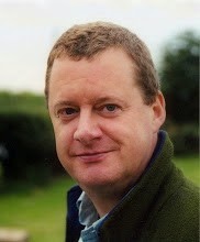
 | Jim Darling joins Kwalee as Chairman |
|
Press releases created by Bruce Everiss for Artforums.co.uk, Bruceongames, Harbury Villagebuzz, Coventry Villagebuzz etc
 | Jim Darling joins Kwalee as Chairman |
|
When David Darling decided to set up a new smartphone app company he needed to name it. That name required several characteristics. It had to be personal to him, it should be unique and distinctive and it needed to have a broader meaning. David's mother, Marilyn, was Australian, descended from Captain Edward Primrose Tregurtha and David spent his early life growing up in the country, where the family had a long established interest in Aboriginal culture. David's grandfather was an electronics engineer who introduced David to this area of technology, creating a lifetime's enthusiasm. Kwalee was the name of David's grandfather's sailing boat on which David spent many happy days as a child. The boat was named after the Australian Aboriginal word for “wait for me”, a message David wants to convey to the millions of app users around the world. He hopes that it will be well worth the wait for the apps that the company promises to deliver. The use of a hand print for the icon works on so many levels.
Of course there is far more to a visual brand than just the name, icon and logo. To this end Kwalee have used the services of top visual brand experts David James Design Ltd, to advise and give their input into such matters as sub brand progression, colour palettes and fonts, as we. David James Design Ltd brand notes: The Aboriginal word Kwalee, means ‘wait for me’. It suggested to us, the idea of ‘waiting for a loved one’ and the visual of a waving hand. This led to the creation of a handprint as the brand symbol. A handprint retains the natural and organic essence of people rather than the stylized simplified icons of corporations. We think this is appropriate for Kwalee as smartphone apps are operated by hand on hand held devices. The angle of the handprint proved critical, if it were if too vertical, it implies ‘stop’, so by gently angling the hand it suggests a friendly waving hand. Equally as important was to retain the natural human qualities of a handprint, whilst creating a flexible vector based symbol that could easily be implemented on both screen and print. The orientation of the handprint posed the question, should we use a left or right hand? We finally decided a left hand looked more natural. Subliminally, we think this is due to the fact that most people are right handed and wave with their right hands. Interestingly, however, when looking at a person waving their right hand, you actually view a left hand. The brand mark is based on the font Aller Bold. This modern sans serif was selected to complement the weight and curves of the handprint. The vibrant yellow colour was selected to clearly differentiate the Kwalee brand in a marketplace predominantly containing red brand marks. Kwalee is an original and pioneering App developer and publisher based in Leamington Spa, United Kingdom.   |
February 2, 2011 --
Bruce Everiss is the author of the popular Bruce on Games and Bruce on Shaving blogs. Now he has turned his keyboard to politics from a UK perspective with Bruce on Politics http://www.bruceonpolitics.com/ This looks at how our society is run, based on a lifetime of observation and a healthy dose of cynicism. Experience tells Everiss that the state is vastly too big, that the freedom of individuals has been taken away to an enormous extent and that we have a dependency culture that saps enterprise.
The stance of the blog is liberal, free enterprise and minimum government. Everiss is excited with the new enterprise: "The whole idea is to come from left field and to provoke thought whilst expressing my own political views. There is a lot that politicians are failing to do to make this a better world, now I can tell them".
